
.jb-spnsrd .article-content .featured-media.featured-media-img{
max-width:80%;
}
.jb-spnsrd .article-content .col-xs-6 > .featured-media.featured-media-img{
max-width:100%;
}
.jb-spnsrd .info-drawer{
text-align:center;
margin: 0 auto 25px;
border: 1px solid #dae1e8;
padding: 15px;
border-bottom-left-radius22: 4px;
border-bottom-right-radius22: 4px;
background-color: rgba(33, 150, 243, .075);
max-width:80%;
}
.jb-spnsrd .info-drawer p{
font-size: 15px;
}
The JamBase Concert Poster Primer
Welcome back to The JamBase Concert Poster Primer, our ongoing series about the amazing evolution of concert posters over the past 70 years.
A Changing Landscape
Imagine kneeling down behind a car at night. You’re with two other people. Your friends are using a screwdriver to pry open a can of evaporated milk. The lid pops open and the sweet smell snakes its way into your nostrils. There’s a chill in the air but you’re sweating. Your friends pour the evaporated milk into spray bottles and hand one to you along with a stack of flyers. You pop up from behind the car and scurry over to a wall. You start postering, using the sticky evaporated milk to slap them up. Suddenly, blue and red lights flash across your handiwork. Busted.
A similar scene played out in real life for Mark Barbeau, artist and de facto manager for San Francisco band Defeatist Attitude and others in the fledgling new wave and punk movements of the 1970s. Like their psychedelic predecessors, the new wave of concert posters sought to advertise shows, however as the music and music business evolved, so too did the look and feel of the artwork. The second installment of a four-part JamBase Concert Poster Primer series, in partnership with Psychedelic Art Exchange – the premier source to buy, sell, and learn about vintage concert posters – will examine The Continued Rise Of Concert Poster Art 1970s – 1990s.
.pae-promo{
max-width:600px;
margin-left:auto;
margin-right:auto;
margin-bottom:30px;
display:block;
padding:0;
background-color:#cc341c;
}
.pae-promo:hover {
background-color:#cc341c;
}
.featured-media .media-img img{
background-color:transparent;
}
Sponsored By

Along with booking gigs and other business for Defeatist Attitude, Barbeau handled most of the poster work as well — from artistic creation to actually pasting them up — with his preferred form of adhesive being evaporated milk. This ingenious, DIY method was one of the aspects that characterized the punk/new wave era in contrast to the slick and polished poster work that came out of the heavily commercialized, big business rock of the 1970s — of which the next era, punk and new wave, were a reaction to.
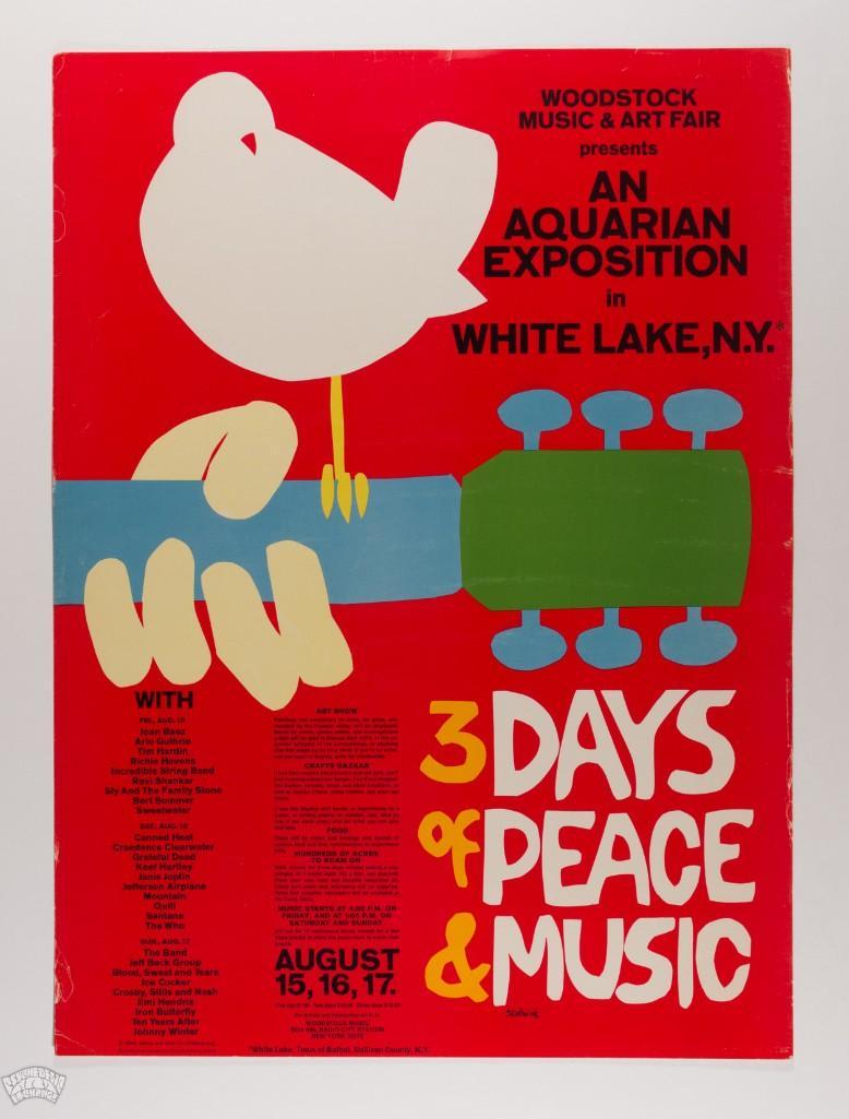
Though the Woodstock Music & Arts Festival in 1969 was known for its simple yet iconic poster by Arnold Skolnick, there was also an original Woodstock poster by David Byrd that had more of a psychedelic slant. Woodstock symbolized the high water mark for the counterculture of the late ‘60s, but ironically marked the beginning of the end for the more organic environment rock existed in.
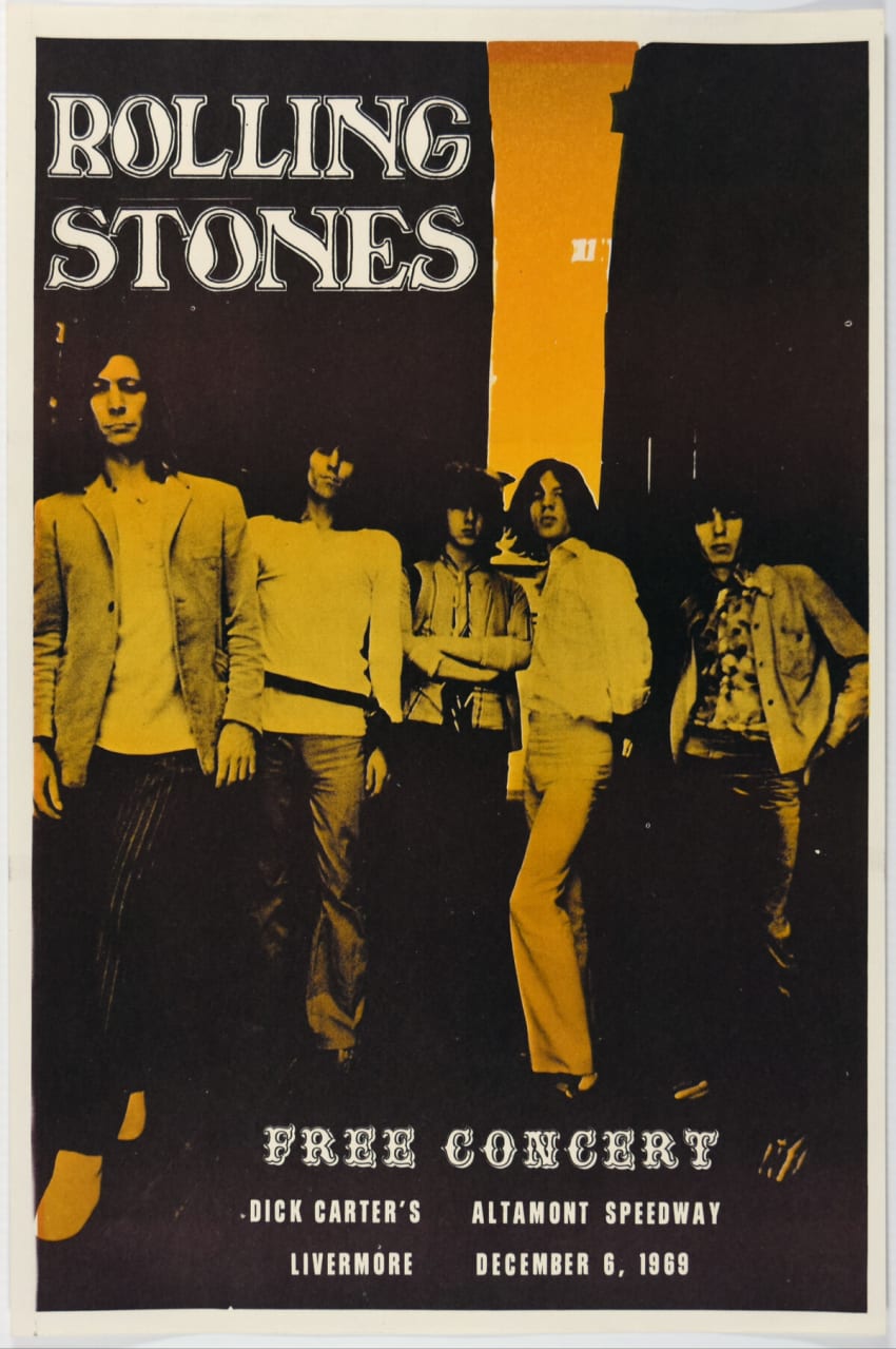
If there was any doubt the winds had shifted from peace and love to something darker, December of 1969 saw The Rolling Stones play a free concert in the Bay Area. Hailed as the “Woodstock West,” the 300k Altamont Speedway attendees experienced a very different vibe than those on Max Yasgur’s dairy farm. The Hell’s Angels became the de facto security, beating attendees with pool cues, and one attendee lost his life. The concert posters for each stand in stark contrast to one another – the 60’s were over.
Courtesy Of Psychedelic Art Exchange
Courtesy Of Psychedelic Art Exchange
As if to cement that fact, shortly thereafter, in 1971, famed concert promoter Bill Graham closed both the Fillmore and Fillmore East concert halls.
Graham characterized the late ‘60s in Paul Grushkin’s book The Art Of Rock: From Presley To Punk as, “a magical time … when people really believed in a new utopia. While most of the people who went to the Fillmore were there just to have a good time, many also thought it was the beginning of a new world.
“But by 1971 I began to feel there was a sense of mass idolatry about rock bands, and what accompanied the work of making concerts happen was big, big business,” Graham continued on rock ‘n’ roll moving into a more commercial space. “The feelings that had first cast a spell over everybody — the musicians, the promoters, the audience — were now slipping away.”
As rock became big business, it naturally moved into bigger venues and several factors accelerated its growth. With rock firmly in the mainstream, concert mongers began promoting shows on FM radio as well as in newsprint. The shift in strategy meant posters were used less often, and those that were produced were more utilitarian in nature, posted in box offices and not widely distributed.
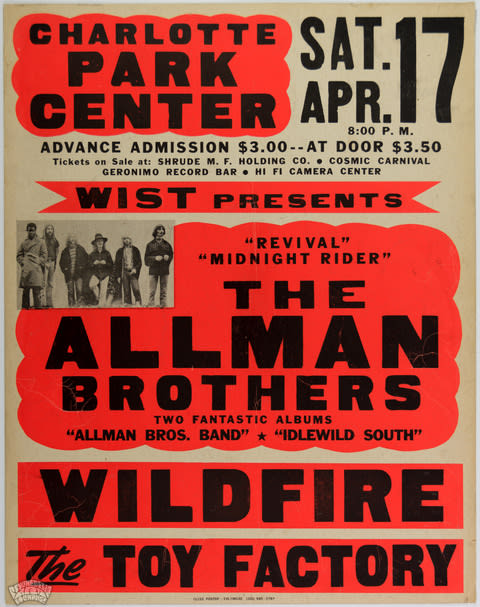
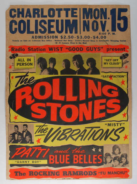
There were, however, a few beacons of light in this concert poster art Dark Ages. Globe, Tilghman and Colby continued to produce boxing-style cardboard posters (as discussed in Part 1 of this series) mostly used for urban R&B performances. Globe, who were best known for their colorful 1950’s rock ‘n’ roll and R&B posters, printed a handful of cardboard ads for some of rock’s biggest acts. The Stones, Led Zeppelin, Jimi Hendrix and The Allman Brothers Band Globe posters from the 60’s and early 70’s have survived in minuscule quantities and are traded quietly among the world’s top collectors.
Courtesy Of Psychedelic Art Exchange
Courtesy Of Psychedelic Art Exchange
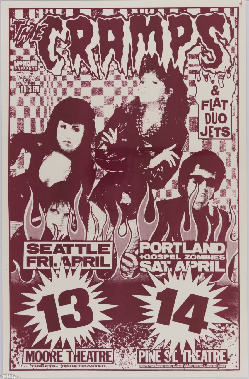
The ‘70s big business saw concert poster art and artistry spread north from San Francisco to the Pacific Northwest. Seattle and Portland became bastions for advertising shows via 11×17 poster stapled to telephone poles. Says poster artist Mike King, considered “the most prolific poster artist of all time,” as per the book Maximum Plunder: The Poster Art Of Mike King, of his work in the mid-’80s “I went from making posters for bands I was in, to making posters for bands I had never heard of and getting paid for it.” King and others’ work helped lay the groundwork for the grunge explosion of the early 1990s in the PNW.
Courtesy Of Psychedelic Art Exchange
Courtesy Of Psychedelic Art Exchange
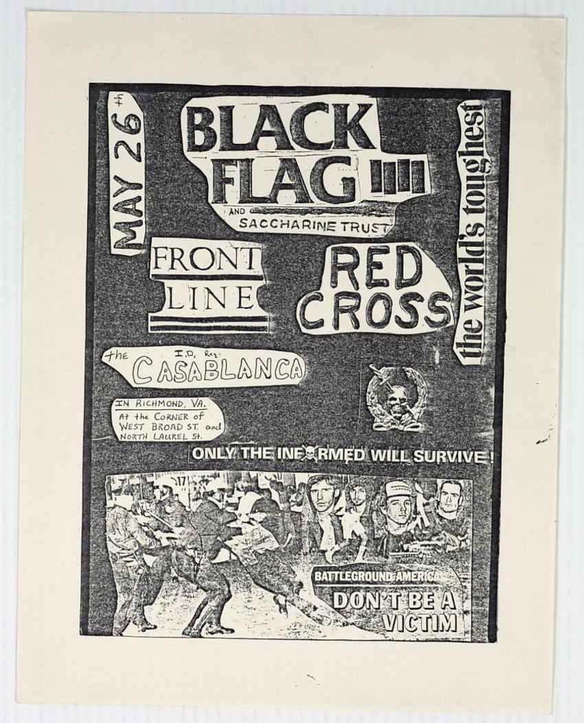
Punk Posters
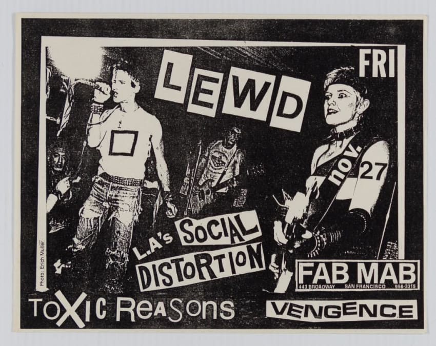
And yet there would be no grunge without punk. Punk — as well as its sleeker and synth-soaked cousin new wave — was a reaction to the commercialization of rock and its excessive decadence in the 1970s as well as the flower power movement of the 1960s. Punk posters and flyers, the latter the punk rocker’s weapon of choice, reflected the movement’s rejection of rock’s earlier epochs. Like the music, the posters and flyers were intentionally rough and made to shock — with simple collages, drawings and sometimes photos as the main mediums.
“A good flier is kinda warped and doesn’t take itself too seriously,” Mark Barbeau said in The Art Of Rock. “The best punk pieces are the least complex, the most careless. The most memorable are the ones that shock, that really offend.”
Courtesy Of Psychedelic Art Exchange
In their simplicity, punk posters stood in stark contrast to the lush poster art of the previous decade.
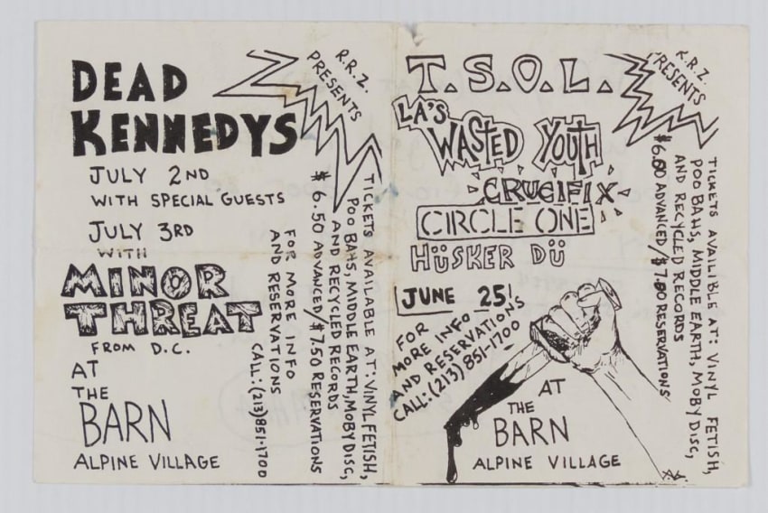
By the 1970s, Xerox machines were becoming more accessible and just about anybody could create posters and flyers en masse. Like postering with evaporated milk, this spoke to punk’s DIY sensibilities. Punk flyers were often designed, photocopied and posted by the musicians themselves. Just as anybody could play punk, anybody could create punk posters.
Armed with their flyers, cadres of punks swarmed into the streets of cities like New York, San Francisco, Los Angeles, Seattle and Portland to paste walls and telephone poles — something that wasn’t received kindly by city officials. Postering itself became an act of defiance. While many of the posters that came out of the 60s, runs were numbered and posters sought-after advertisements, but in the collectible sphere, the proliferation of punk posters made them tough to authenticate or understand in what scale they were produced – very much in line with the punk ethos itself.
Courtesy Of Psychedelic Art Exchange
Courtesy Of Psychedelic Art Exchange
Psychedelic Lives On!
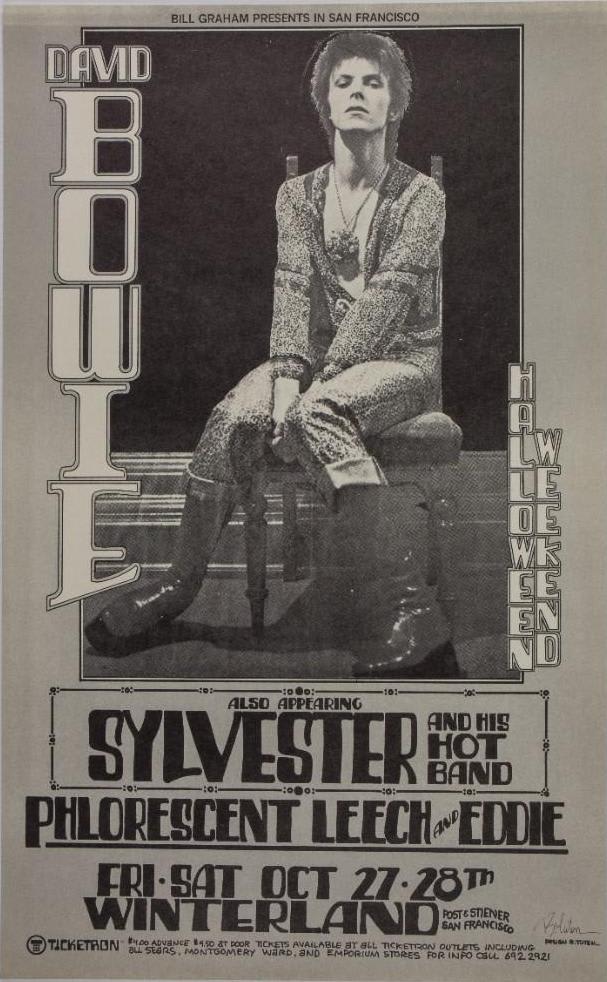
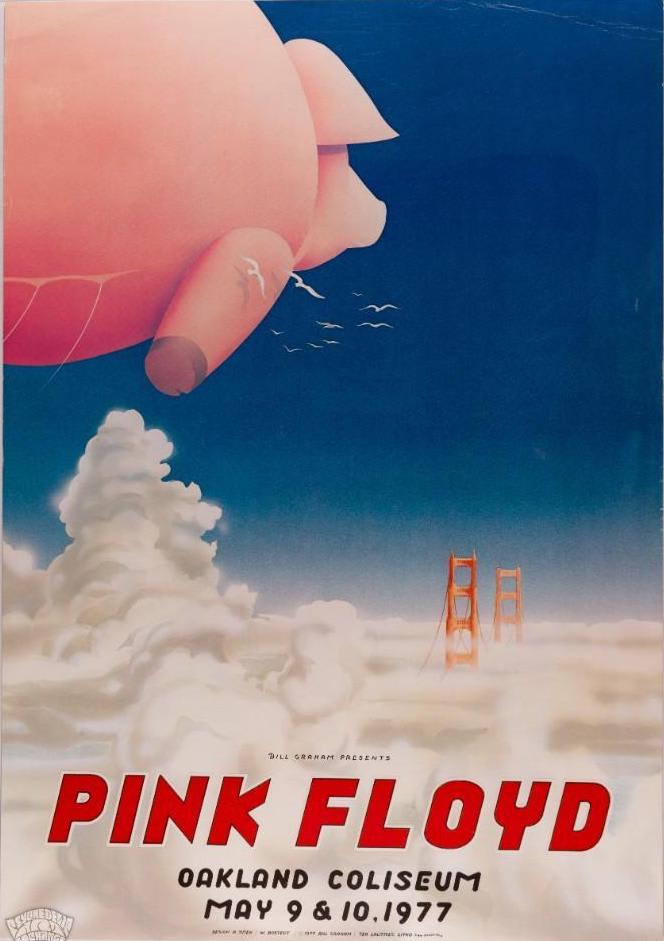
While punk and new wave were the rage, concert poster art and collecting were kept alive by bands, artists and promoters from or inspired by the psychedelic era. Although the Bill Graham numbered series came to a close with the shuttering of the Fillmore and Fillmore East, Graham continued to commission posters for bigger shows at San Francisco’s Winterland Ballroom, which opened as a music venue in 1971, around the same time the Fillmores shuttered.
Courtesy Of Psychedelic Art Exchange
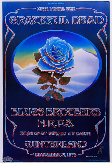
Winterland, however, was not long for the world either and was closed on December 31, 1978, with an iconic and well-documented Grateful Dead concert. The poster Graham commissioned for the farewell show is as iconic as the concert itself. By the late ‘70s, Graham and other promoters were relying more on newspaper and radio ads to spread the word about their shows.
Graham did continue to work closely with poster artists for larger events in the Bay Area and beyond, most notably David Singer and Bill Graham Presents in-house artist Randy Tuten. Graham also continued his collaboration with some of the psychedelic era’s “Big 5” artists like Stanley Mouse and Alton Kelley, who created the famous “Blue Rose” image for the Grateful Dead’s “Closing Of Winterland” concert.
Courtesy Of Psychedelic Art Exchange
Courtesy Of Psychedelic Art Exchange
Courtesy Of Psychedelic Art Exchange
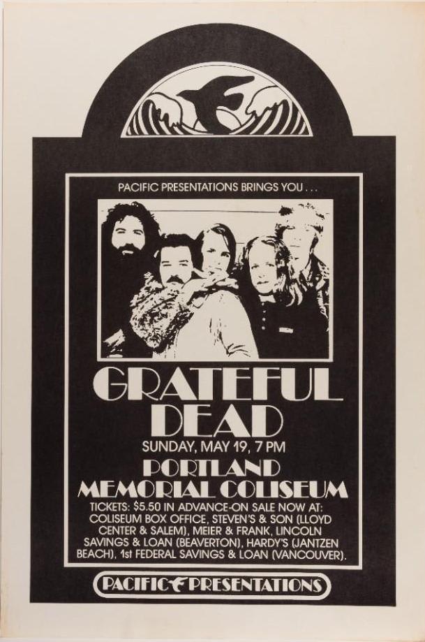
But perhaps most important in carrying on the spirit of the psychedelic ‘60s as well as psychedelic concert poster art were the Grateful Dead themselves. Not only did the band continue to commission posters for their shows, but the community that had formed around the band — who would come to be known as Deadheads — provided a vibrant marketplace for trading and selling items of all kinds, including poster art. Naturally, LSD was on the buffet at the bazaar which would come to be known as Shakedown Street. Often disseminated on blotter paper, LSD blotter art emerged as a medium unto itself.
Blotter paper became the preferred method of delivering LSD in the late ‘60s shortly after the psychedelic drug became illegal. As the law dictated, the severity of an LSD charge was quantified by weight. Before the late ‘60s, liquid LSD was usually dropped onto a sugar cube. But the new law made sugar cubes undesirable because they weighed more than a sheet of paper.
Stanley Mouse blotter Courtesy of Psychedelic Art Exchange
It didn’t take long for artists to start using that paper to express themselves, which naturally led to people collecting the blotter sheets as art. Some of the renowned artists who created blotter art are R. Crumb, Alex Gray, Thom Lyttle and Alexander Shulgin. But perhaps the king of blotter art is Mark McCloud. While McCloud is an artist, he is also a big blotter art collector. He’s dubbed his house in San Francisco, a museum of sorts for blotter art, the Institute of Illegal Images, and he should know as the authorities have charged him twice in connection to the blotter in his house — which his website Blotter Barn calls “the most comprehensive collection of decorated LSD blotter paper in the world.”
McCloud began collecting blotter art after a near-death and what he called a “rebirth” experience, in a 2016 profile in Wired, when he fell from a window while tripping on acid.
“I was on LSD when I had my death-rebirth experience. It would have just been a death experience without the LSD, for sure,” McCloud stated in Wired.“That’s a recurring theme in LSD. A lot of people think they would have died when they had an accident [without the LSD].” McCloud also said he had taken the famed “orange sunshine” acid when he had his accident and his gratitude for the drug led him to begin collecting blotter.
In 1988, McCloud curated The Cure of Souls event at Psychedelic Solution Gallery in New York City and has also held a more recent exhibition at Fifty24SF in the Bay Area. Although he lives in the psychedelic mecca of San Francisco, McCloud stated in the Wired profile that Austin, Texas is actually the birthplace of psychedelic rock. “The first record to have the word ‘psychedelic’ on the album was The 13th Floor Elevators, from Austin,” he said. In the next section, we’ll examine the importance of Austin and other cities in the continuation of psychedelic art.
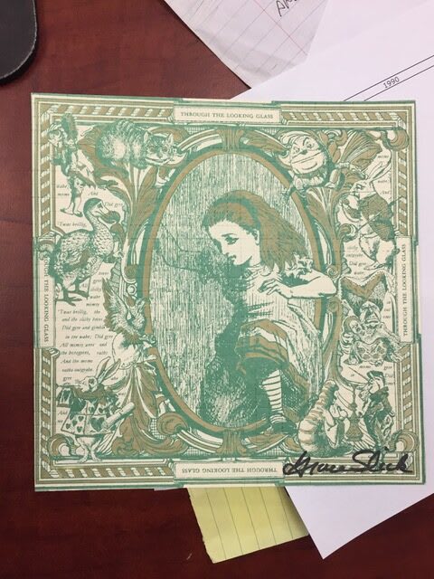
Grace Slick signed Alice blotter art Courtesy of Psychedelic Art Exchange
Merry Prankster signed blotter art Courtesy Of Psychedelic Art Exchange
Concert Poster City Strongholds & Artists
In Austin, Texas — dubbed the Live Music Capital Of The World — psychedelic concert poster art thrived around venues like the Vulcan Gas Company, which opened in 1967 as Austin’s first psychedelic dance hall. The proliferation of venues necessitated the need for eye-catching advertisements and renowned underground comics artist Gilbert Shelton, of Freak Brothers fame, acted as the Vulcan’s art director.
In his time at Vulcan, Shelton worked closely with artist Jim Franklin, who was literally the artist in residence — living and creating upstairs at Vulcan. Shelton would soon follow other Texans like Family Dog’s Chet Helms to San Francisco, leaving Franklin as one of the primary artists in Austin. JamBase reached out to artist Rick Turner, who was part of the Austin scene and recalled Franklin’s artistry.
“The visual vacuum created by the westward exodus was briefly inhabited by Jim Franklin, a deeply gifted artist friendly with all the originals who had taken up residency upstairs at the Vulcan. In the cavernous loft above the club, Franklin cranked out posters and paintings that were absolutely true to his own unique vision. Growing up near Galveston and spending time in both New York and San Francisco, his visual vocabulary gravitated toward the mindset of Dalí and Magritte, rather than the Art Nouveau and Op Art-inspired posters from the Bay Area. A ‘centex surrealist’ mentality with tongue firmly in cheek, he dominated the poster scene during the transition years 1969 to 1972, bridging the Vulcan and Armadillo eras.”
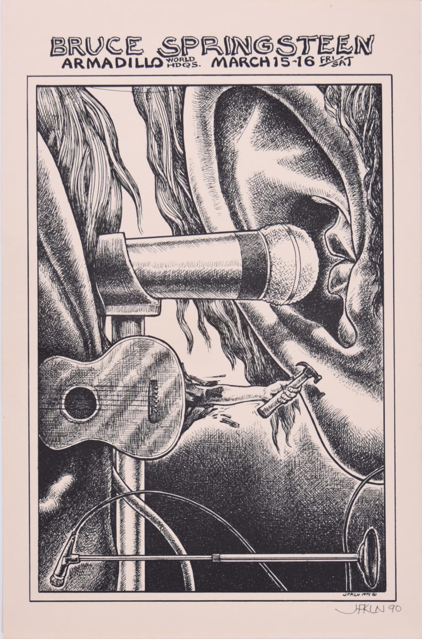
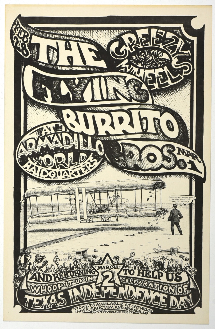
Turner speaks of Armadillo World Headquarters, which opened in 1970 after its predecessor Vulcan Gas Company closed. Jim Franklin and colleague Micael Priest were two of the most notable creators in the Vulcan and Armadillo scenes. Franklin and Priest were prominent members of a collective dubbed the “The Armadillo Art Squad.” The Armadillo had an impressive run of posters throughout the 1970s for an eclectic mix of genres from the rock, blues, country, folk and bluegrass spheres, highlighted by musicians like Jerry Garcia, Willie Nelson, Bruce Springsteen, Taj Mahal, Earl Scruggs, The Flying Burrito Brothers, local favorites Shiva’s Headband and many more.
Courtesy Of Psychedelic Art Exchange
Courtesy Of Psychedelic Art Exchange
Courtesy Of Psychedelic Art Exchange
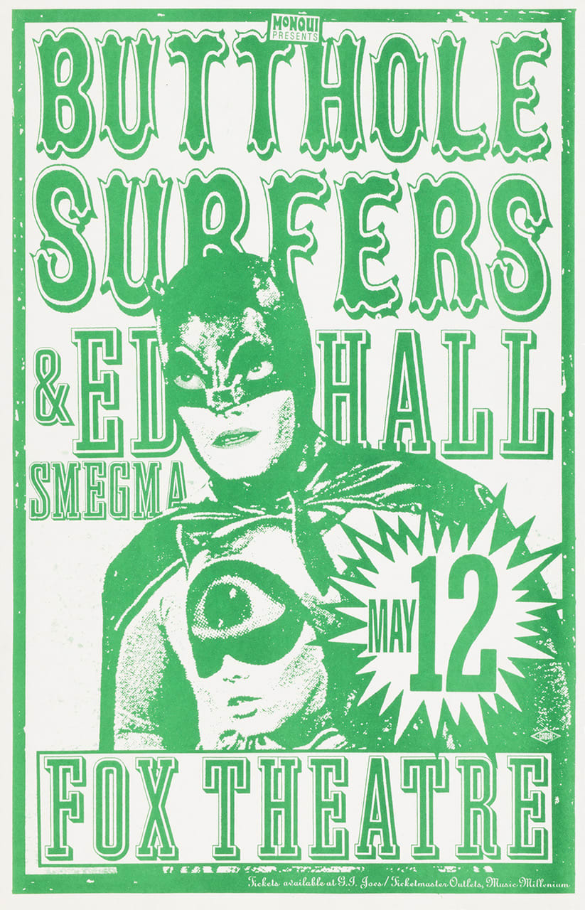
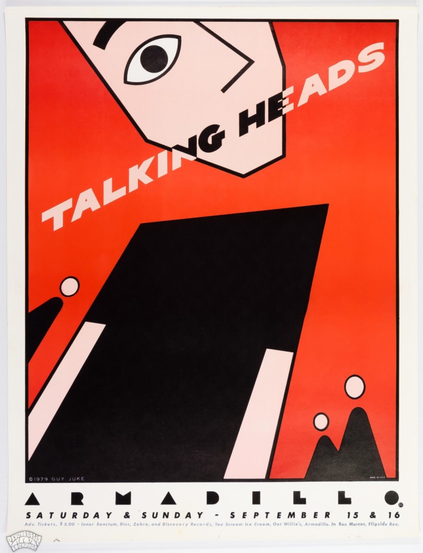
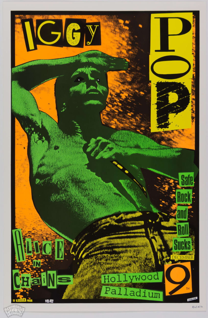
While the Armadillo closed in 1980, another creator in the artistic bastion of Austin helped to revive concert poster art as well. Born in Madrid, Frank Kozik moved to the Texas capital when he was 14 and began creating posters for Austin rock acts. Kozik mastered the screen printing method and his work was characterized in a 2001 Texas Monthly profile.
“While his style was reminiscent of the rock-poster art of the ’60s — and he’s often credited with reviving that art form — Kozik went beyond the standard psychedelic imagery, combining powerful pop culture iconography and bold, fluorescent colors. His garish and often ribald visions took the form of menacing cartoon characters, bawdy pinup girls, and naive, childlike figures juxtaposed with macabre images.”
With his edgier aesthetic, Kozik became popular with musicians in the angsty alternative rock and grunge movements. Kozik worked with alt-rock and grunge legends like Nirvana, Pearl Jam, Soundgarden, Stone Temple Pilots, Sonic Youth, Red Hot Chili Peppers, Melvins, The Offspring, Butthole Surfers and more. Kozik also did art for the Godfather Of Punk: Iggy Pop.
Courtesy Of Psychedelic Art Exchange
Much like Austin in the South, Seattle and Portland became concert poster art torch bearers in the Pacific Northwest. Venues like Paramount Northwest kept concert poster art alive in the big business rock world of the 1970s. Due to the water-logged climate, “cardboard was predominantly used till the late ‘70s” and those posters have become “a special sub-niche of poster collecting,” says Glen Trosch, owner of Psychedelic Art Exchange.
Courtesy Of Psychedelic Art Exchange
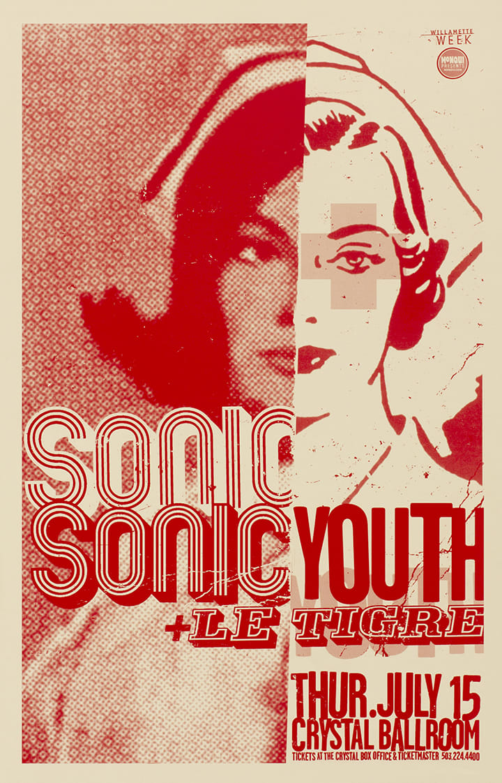
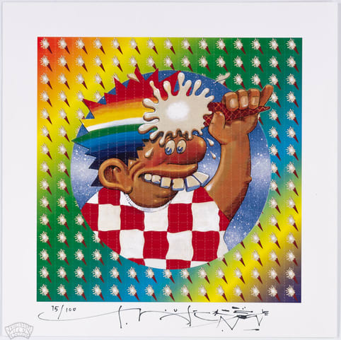
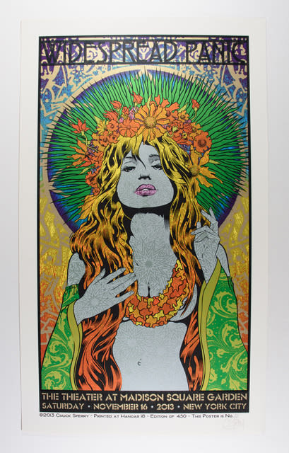
Yet, San Francisco will forever be the mecca of psychedelic concert poster art and many of today’s most prominent poster artists operate in the Bay Area. Two of the most notable are Chuck Sperry and Ron Donovan, who founded The Firehouse Kustom Rockart Company, specializing in screenprint and design. Sperry has become something of a celebrity in the concert poster art world and beyond. Juxtapoz Magazine stated, “Chuck has propelled the American rock poster genre to a new level of fine art status with his print work,” as per Sperry’s website.
Artists like Sperry and others have ushered in a new generation of concert poster artists that have achieved a degree of celebrity. The rise of the jam band scene over the past 30 years, culturally and socially similar to the psychedelic era, yet with some punk sensibilities, has provided a constellation of bands for the next generation of concert poster artists to create for. Stay tuned for Part 3 of The JamBase Concert Poster Primer: The New School of Concert Poster Artists.
Courtesy Of Psychedelic Art Exchange
Courtesy Of Psychedelic Art Exchange
More from
The JamBase Concert Poster Primer
{
“@context”: “http://schema.org”,
“@type”: “Article”,
“url”: “https://www.jambase.com/article/the-jambase-concert-poster-primer-part-2-the-continued-rise-of-concert-poster-art”,
“mainEntityOfPage”: {
“@type”: “WebPage”,
“@id”: “https://www.jambase.com/article/the-jambase-concert-poster-primer-part-2-the-continued-rise-of-concert-poster-art” },
“image”: [
{
“@type”: “ImageObject”,
“url”: “https://www.jambase.com/wp-content/uploads/2022/09/jb-2022-psychedelic-art-exchange-hero-image-v001-part-2.png”,
“width”: 580,
“height”: 300 }
],
“headline”: “The JamBase Concert Poster Primer: Part 2 The Continued Rise Of Concert Poster Art”,
“name”: “The JamBase Concert Poster Primer: Part 2
The Continued Rise Of Concert Poster Art”,
“description”: “The second installment of a four-part JamBase Concert Poster Primer series, in partnership with Psychedelic Art Exchange, examines The Continued Rise Of Concert Poster Art 1970s – 1990s.”,
“articleBody”: “”,
“author”: {
“@type”: “Person”,
“name”: “Nate Todd” ,
“url”: “https://www.jambase.com/author/ntodd0483” ,
“sameAs”: [“https://natetodd.bandcamp.com/music”] },
“datePublished”: “2022-09-27T21:00:24+00:00”,
“dateModified”: “2022-09-27T21:16:06+00:00”,
“publisher”: [
{“@type”:”Organization”,”name”:”JamBase”,”logo”:{“@type”:”ImageObject”,”url”:”https://www.jambase.com/wp-content/uploads/2016/01/jambase-logo-navy-on-white.png”,”width”:360,”height”:60}} ]
}
The JamBase Concert Poster Primer: Part 2
The Continued Rise Of Concert Poster Art
{
“@context”: “http://schema.org”,
“@type”: “Article”,
“url”: “https://www.jambase.com/article/the-jambase-concert-poster-primer-part-1-the-rise-of-concert-poster-art”,
“mainEntityOfPage”: {
“@type”: “WebPage”,
“@id”: “https://www.jambase.com/article/the-jambase-concert-poster-primer-part-1-the-rise-of-concert-poster-art” },
“image”: [
{
“@type”: “ImageObject”,
“url”: “https://www.jambase.com/wp-content/uploads/2022/08/jb-2022-psychedelic-art-exchange-hero-image-v001.png”,
“width”: 1200,
“height”: 620 }
],
“headline”: “The JamBase Concert Poster Primer: Part 1 The Rise of Concert Poster Art”,
“name”: “The JamBase Concert Poster Primer: Part 1
The Rise of Concert Poster Art”,
“description”: “This first installment in a four-part JamBase series in partnership with Psychedelic Art Exchange examines The Rise of Concert Poster Art: 1950s u2013 1970s & Ties to Counterculture.”,
“articleBody”: “”,
“author”: {
“@type”: “Person”,
“name”: “Nate Todd” ,
“url”: “https://www.jambase.com/author/ntodd0483” ,
“sameAs”: [“https://natetodd.bandcamp.com/music”] },
“datePublished”: “2022-09-06T20:44:48+00:00”,
“dateModified”: “2022-09-20T19:14:06+00:00”,
“publisher”: [
{“@type”:”Organization”,”name”:”JamBase”,”logo”:{“@type”:”ImageObject”,”url”:”https://www.jambase.com/wp-content/uploads/2016/01/jambase-logo-navy-on-white.png”,”width”:360,”height”:60}} ]
}
The JamBase Concert Poster Primer: Part 1
The Rise of Concert Poster Art


